An Interview with Book Designer Kate Hargreaves

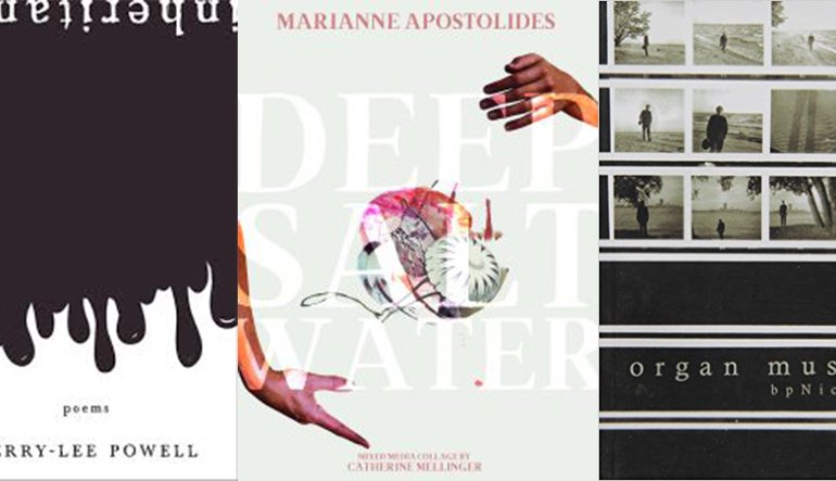
Kate Hargreaves is a writer and roller derby skater who also happens to be one of the most active literary book and cover designers in Canada over the past few years, having designed titles for NeWest Press, BookThug, Biblioasis, Black Moss Press and Palimpsest Press, including Deep Salt Water by Marianne Apostolides (BookThug), Inheritance by Kerry-Lee Powell (Biblioasis), Lost Originals by David B. Goldstein (BookThug), Organ Music by bpNichol (Black Moss) and Bla_K by M. NourbeSe Philip (BookThug).
Hargreaves is also a writer, having released a collection of poetry, Leak (BookThug), in 2014, with a YA novel on the way (Orca, 2019). I talked with her about book design and the intersection between her design and literary work.
Rob Mclennan: How did you first get started doing design work?
Kate Hargreaves: I sort of stumbled into book design when I was still in graduate school. I was working doing general admin and some layout design for The Windsor Review literary magazine. I had learned the very basics of the inDesign software in an undergraduate publishing class and had typeset a couple books as part of that course. I was also designing zines and chapbooks here and there for my creative writing classmates and some artist friends. The publisher of The Windsor Review, Marty Gervais, also runs Black Moss Press, so I started doing a little bit of work on the side for him, including editorial and typesetting. When his cover designer went on vacation and he needed a book designed on a tighter deadline than expected, he asked me if I knew how to do covers. I essentially told him I could figure it out. It may have taken me some time, but I got the cover done and it seemed to satisfy everyone involved. After that, I started doing more covers for Black Moss and gradually increased my comfort level with the software and book design in general.
When I graduated from my MA, I was looking for a full-time job in publishing, so Marty recommended me to Dan Wells at Biblioasis, who hired me in a general publishing assistant capacity. I ended up designing two covers in the first few weeks I was there, and gradually started taking on more and more cover design responsibility, along with designing marketing materials and doing a share of the press’ typesetting work.
Working at Biblioasis for three years allowed me to continue to develop my design skills and work in a variety of different styles and genres, from poetry to local history and cookbooks. I also realized during this time that design, and cover design specifically, was my favourite part of the publishing industry. I wanted to be able to focus my energy on design only, so I decided to become a freelance book designer.
RM: How does your experience with design impact on your literary work, if at all? When you begin to write, how do you see the page?
KH: I think I’m more aware of the limitations of book size than I used to be before I was working in the design field. Realizing that the space constraints of a standard-size book are very different than an 8.5 x 11″ sheet of paper influences the way I put words down on a page to some degree. From a purely practical standpoint, I know I can’t scatter long lines all over a page and expect them to reproduce the same way when published. I write a lot more prose poems than I used to, and it may be because they aren’t so dependent on line breaks. I like the way a fully justified block of prose poetry looks on a page.
RM: What is the first thing you look at when starting a new design job?
KH: I try to get a feel for the tone of the book. Whether that means looking at a design brief if I have one, or any suggested imagery or artwork provided by the author or publisher, I like to get an idea of what mood I need the cover to convey. If I don’t have much to go on, I will mine the manuscript (if I have one) for stand-out images. I might research what other books by the same author, or on the same subject, look like in order to make sure this one stands out. I also try to read as much of the book as possible in order to let my brain mull on the text and the design even while I’m at the gym or washing the dishes or generally not focusing on design.
RM: I remember there was a Canadian book designer a decade or two back that, upon working for a few too many publishers around the same time, managed to create a similar tone to far too many Canadian literary titles, making a whole round of books feel exactly the same. I’m pleased that a new slate of designers have emerged since, thus breaking this unsettling trend, but how do you keep from repeating yourself in your own design work? Is this something you worry about, or even see?
KH: It is definitely something I keep in mind. I think there is a fine line between creating a personal style where folks can identify a cover you designed at a glance, and re-doing the same cover over and over. I have had the opportunity to work on a wide variety of genres and within those genres a wide variety of styles, so I think this has helped keep me on my toes in terms of varying my designs. Every book is so different, so I think the covers need to reflect that. I do sometimes pay homage to a style (not necessarily a book design but a poster, or a film, or a general design trend) but I try to do it with a degree of self-awareness and to turn it on its head in some way. I also like to try new things and learn through my work, so if I have an idea that incorporates design elements I’m not sure how to create, I try to learn. I think that helps keep things fresh as well.
RM: Are there specific designers who have influenced the ways in which you look at a new project?
KH: There are some really wonderful designers working at the moment. I think sites like The Casual Optimist and Spine Magazine are great resources when I’m feeling uninspired and want to be impressed by all the work being produced by other people. I don’t necessarily seek out particular designers but I tend to really enjoy the work of Ingrid Paulson, David A. Gee, Peter Mendelsund, Zoe Norvell, Natalie Olsen, Jess Sullivan, Michel Vrana, off the top of my head, and obviously numerous others. While they haven’t necessarily influenced how I look at a particular project, I definitely like to check out what other people are doing and see how other designers are pushing the limits of their designs. I used to work in an office attached to a book shop, so when I was stuck I would wander through and look at hundreds of designs to see if anything gave me the spark I needed. Often, the inspiration wouldn’t end up impacting the design I was working on in a way anyone else could even notice, but it was enough to get me started in a productive direction.


